chanello
Wednesday, 20 March 2013
Monday, 18 March 2013
Saturday, 23 June 2012
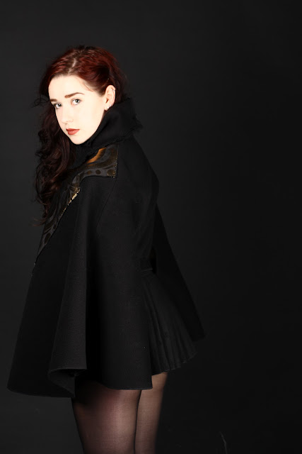
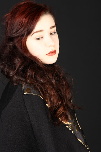
"Renouveau Femme"
"Renouveau Femme"
My final submission for my first year of my degree. Inspired predominantly by the Renaissance and gothic architecture with my target fashion house and brand being Comme des Garcons.
All designs, interpretation, construction, styling, photography by Emma Cook
Modelling by Aislinn Price ( @PetiteFilleRouge)
Friday, 22 June 2012
"Plain White Tee"
My design for a project set "Plain White Tee"
Design, construction, styling, modelling all by Emma Cook.
Thursday, 29 March 2012
"A Business Plan"
Throughout my studies of context of practise I have found the communication of fashion most interesting and rewarding, the advertising, the promotion, the presentation of fashion.
When developing my ideas and artifact I kept coming back to the concept of a marketing and advertising business plan of which, lets say, perhaps, a designer would use to promote a new collection.
My original idea for the artifact brought me to this marketing concept. Originally, I wanted to create a projection, the design of which would be the same as my current artifact, however, I wanted to combine video alongside these still images. This juxtaposition of video and still image in one publication or projection was something of which, unfortunately, I have no knowledge of and did not know how to create my desired effect. The idea to this would be that there would be street style images, interspersed with video captions, ultimately creating an innovative look. The audience, under the impression that all the images were still, but then - a slight movement of the hand or head of one of the 'still' images would create an odd, interesting angle to the design.
My idea was that a designer could take this concept of projection, using images and video of models in their own garment or product collection, to create a strange but, I feel, very memorable and effective marketing and promotion strategy.
I feel this concept idea would work very well if the collection was, perhaps, a futuristic style, where the sudden, unexpected jolts of movement, almost like a static electric shock, placed alongside the still images would create a computerised effect to what the audience believed was just photographic images. Thus, making this effective in its goal to communication the fashion designers' idea, thoughts and brand. I played around using Photoshop to visualize the effectiveness of my design idea.
Another marketing strategy I had was to use a promotional video, as I feel they are incredibly successful in creating promotional stir withing our viral age of society.
The main thoughts I had for this was to take the idea of identity and style as the forefront to the concept of the video. You would see a shot of an ordinary shopping street in a city, no people to be seen at all. Then, you see a quick shot of a figure briskly walk across screen, progressively there begin to emerge more and more individual people, all going about there own business of life - some on phones, others holding briefcases, rushing to their next meeting. The time lapse of the video begins to speed up and the music begins to rise in a crescendo as more individuals are seen in the street, creating a hustling energy of separate lives in one place.
The defining idea to the promotional video is that each and every person seen are dressed in a designers clothing, entirely from one collection, creating a surreal look of conformity. I thought this video would make the audience think. The idea I wanted to communicate is that, perhaps we are not all individual identities, or even perhaps, that this particular designers collection is so utterly fashion forward that there would be no need for any more designs, ideas or new innovation ...
My general idea of how I imagine the video to look like. Again I used McQueen's Spring/Summer 2010 collection as I liked the futuristic, surreal look of the collection in context with the communication of the eerie message in the video.
Subscribe to:
Posts (Atom)


